Simplifying Technical Confluence: The Overlay Chart Trading Indicator
Day traders often struggle with screen clutter when trying to build a robust technical strategy. Monitoring multiple technical elements simultaneously—such as historical support zones, short-term momentum shifts, and overall structural trends—typically requires keeping several charts or crowded indicator sub-windows open at once. This visual fragmentation can cause cognitive fatigue and lead to missed entry signals or poorly timed executions during volatile market sessions. The Overlay Chart Trading Indicator solves this structural dilemma by condensing complex technical fields directly onto your main price screen.
Here is an analytical breakdown of how this multi-tiered tracking tool organizes market data to optimize your trading execution.
The Architecture of Integrated Price Overlay Systems
The core goal of the Overlay Chart Trading indicator is to establish immediate technical confluence. Instead of isolating calculations into independent sections below the price window, the indicator uses an optimized multi-period framework to display trend boundaries and momentum triggers directly alongside active candlesticks.
By tracking historical lookback periods simultaneously, the underlying script calculates major market Supply And Demand regions in real time. This unified layout allows traders to assess the market structure instantly. It clarifies whether a minor intraday pullback is merely an expected reaction within a healthy trend or the start of a structural reversal.
Decoding the Visual Matrix and Trend Boundaries
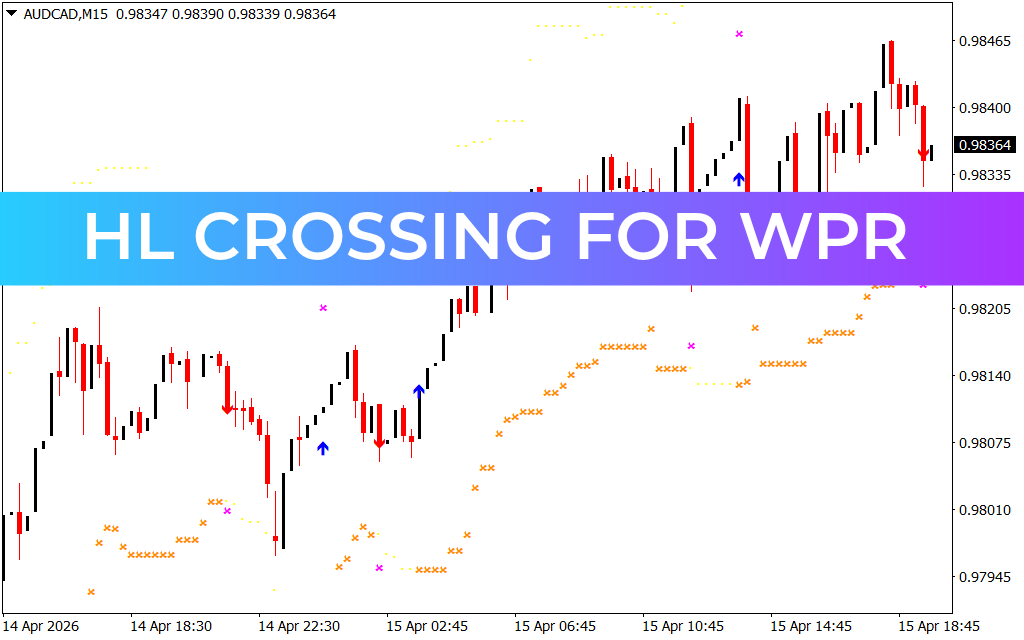
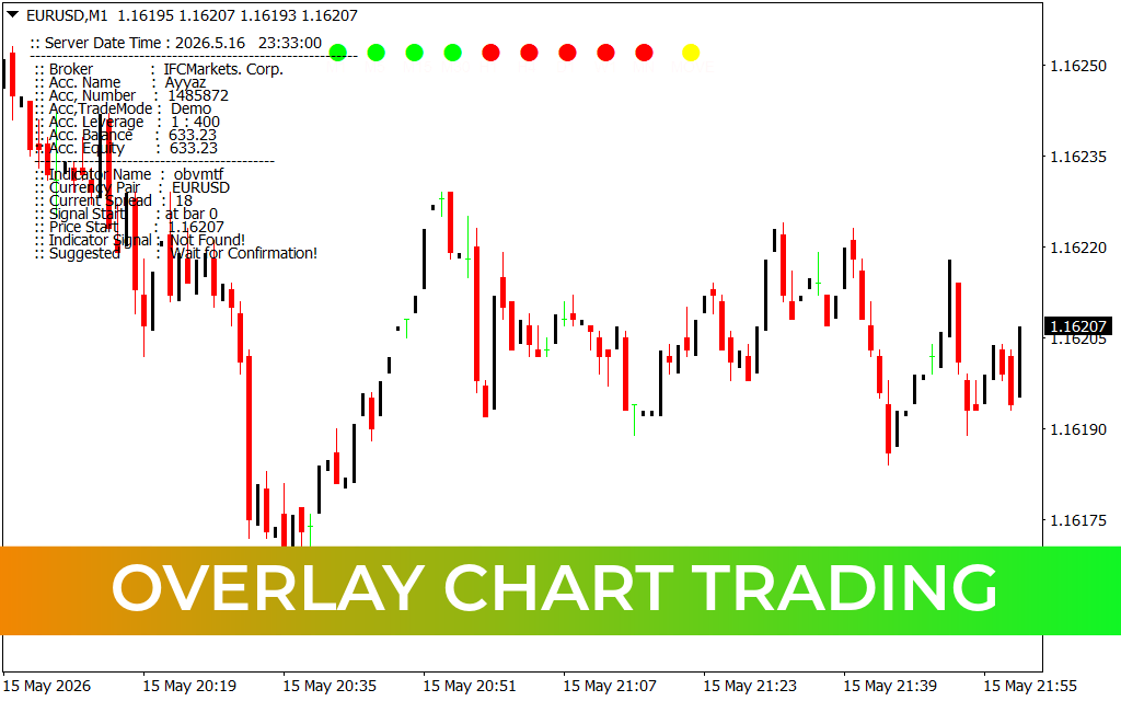
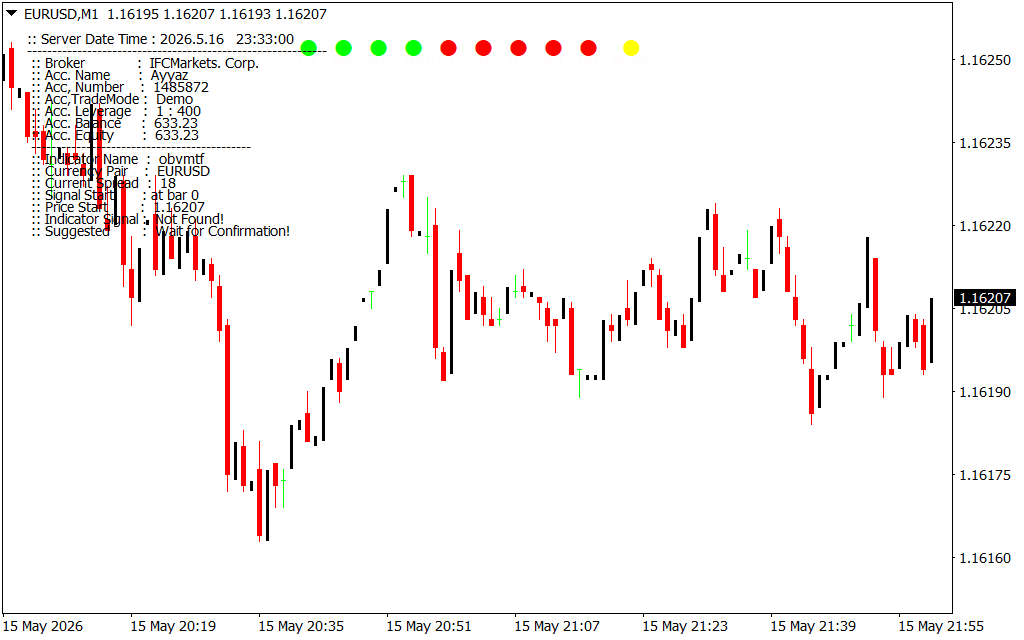
As displayed on the EUR/USD 1-hour workspace, the indicator simplifies complex algorithmic parameters into highly responsive visual markers:
- The Upper Institutional Boundary (Solid Red Line): This tracking line maps dynamic overhead resistance ceilings. When the market moves into a distribution phase, this upper boundary scales along with price peaks, defining high-probability areas for short positions or profit targets.
- The Lower Accumulation Floor (Solid Green Line): Conversely, the green step-line identifies historical demand pockets. This floor helps traders pinpoint where institutional buying volume is stepped up to defend key structural levels.
- The Bullish Confirmation Nodes (Green Dots): To assist with precise entry timing, the system prints green dots near structural troughs. These nodes appear when short-term velocity aligns with the broader underlying demand floor, highlighting optimal long setups.
- The Bearish Liquidation Nodes (Red Dots): Plotted near overhead peaks, these red dots signal localized momentum breakdowns. They alert sellers that bullish exhaustion has set in within the dynamic supply channel.
Strategic Execution Rules for Active Terminals
To build a consistent technical edge using the Overlay Chart Trading matrix on your terminal, implement these professional guidelines:
- Trade the Boundary Alignments: Focus your trade entries primarily when validation nodes print near the major horizontal boundaries. A green dot appearing precisely as the market touches the green support floor provides a reliable setup.
- Dynamic Trailing Management: Use the opposite horizontal boundary line to establish objective profit targets. If you execute a long trade off the lower green support line, manage your risk dynamically until price tests the red resistance ceiling.
- Strict Invalidation Parameters: Position your defensive stop-loss orders just beyond the active step-line boundaries. Because these lines represent mathematically verified structural limits, a sustained candle close past them invalidates the setup.
2 Downloads
Last Update:
May 17, 2026 02:34 AM
Published:
Jan 20, 2026 22:26 PM
Category: