Navigating Price Corridors: The Working Inside Channel Indicator Explained
Financial markets spend a significant portion of their trading life cycle locked within horizontal or diagonal price corridors. For day traders and swing traders alike, buying near the floor of a structural channel and selling near its ceiling is one of the oldest and most reliable ways to secure a mathematical edge. However, manually drawing these boundaries across multiple currency pairs can be highly subjective and prone to error. The Working Inside Channel Indicator eliminates this guesswork by automatically calculating and plotting dynamic volatility corridors directly onto your trading charts.
Here is an analysis of how this technical tool functions and how to use its structural bands to optimize your intraday execution.
The Structure of Dynamic Price Channels
Unlike fixed horizontal Support And Resistance levels, a dynamic channel adapts continuously to incoming price data and shifting volatility. The indicator calculates an upper and lower envelope based on the asset's structural swing points and recent average true range.
The resulting bands map out the mathematical boundaries of the current trend, establishing clear parameters for where an asset is considered structurally overvalued or undervalued. By anchoring these levels automatically, the indicator allows traders to maintain a consistent perspective on institutional order flow.
Interpreting the Upper and Lower Boundaries
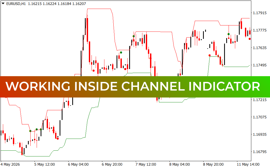
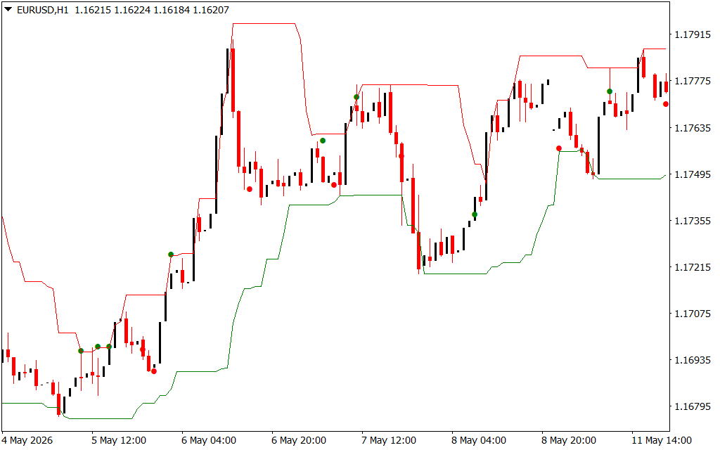
As demonstrated on the EUR/USD H1 chart, the indicator tracks Price Action using two distinct structural lines and color-coded alert nodes:
- The Upper Resistance Envelope (Red Line): This boundary represents the distribution ceiling where buying momentum historically exhausts itself. When price rallies to touch this upper band, it signals that the market is overextended, warning traders to tighten stop-losses on long positions or look for short setups.
- The Lower Support Envelope (Green Line): This line represents the accumulation floor where buyers consistently step in to defend price. When the candles decline to touch this green boundary, the asset is technically oversold within its current regime.
- The Confirmation Signals (Green and Red Dots): To enhance execution timing, the indicator plots precise dots at key structural turning points. A green dot near the lower band confirms a successful test of support, while a red dot near the upper band highlights verified distribution at resistance.
Because these bands flatten out during ranges and slope sharply during major market expansions, the angle of the channel provides an immediate, scannable reading of the current macro trend.
Strategic Guidelines for Active Trading
To successfully incorporate the Working Inside Channel Indicator into an active trading terminal, consider these professional guidelines:
- Mean Reversion Execution: In range-bound markets, look for price to touch the lower green band, print a green confirmation dot, and reject the level before executing a long position toward the upper target.
- Breakout Tracking: If a 1-hour candle breaks completely outside the channel and closes firmly above the red line or below the green line, the channel model is temporarily invalidated. This signals the start of an explosive new momentum trend rather than a standard mean-reversion move.
- Conservative Stop Placement: When entering a long position off the lower boundary, place your defensive stop-loss order just beneath the green support line. This ensures a tight risk parameter with a highly favorable risk-to-reward ratio.
1 Download
Last Update:
May 17, 2026 01:57 AM
Published:
Jan 20, 2026 22:56 PM
Category: